Adaptive web design
Adaptive web design
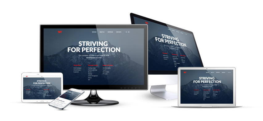
When browsing usual web-sites on a smartphone you get the feeling that the site just isn’t made for that. Web site does work but using it isn’t convenient. And that’s understandable – because it’s made for browsing on a big monitor of a PC and using a computer mouse. However, modern trends in the world of computer technologies show that compact device market – tablets, phablets and smartphones – is growing at a rapid pace. More often users go on the internet through mobile phones, compact devices and that can’t be ignored.
Adaptive web design is the right solution for this problem. It allows to create a universal web-site which will be easy to use on different devices.
A live example of using this method You can see by entering our site from a mobile device or just decreasing the window size of your browser. Nominal size of the device decreases but the work with the site does not suffer from that. The reason for this is that the designer has taken care of that when designing the page. Thus navigation remains thought out, necessary information is found quickly and the web-site is still easy to use.